Tuesday, May 8, 2012


CONTINUED EXPLORATION


Trees were created by dripping and draining ink off the canvas at an angle. It seems to create these unique textured and organic lines resembling trees. This was my first attempt. i really like how the trees and textures add to the sense of death and decay in this grey forest.


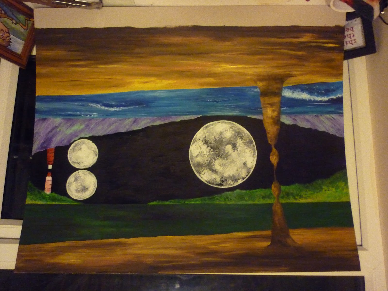
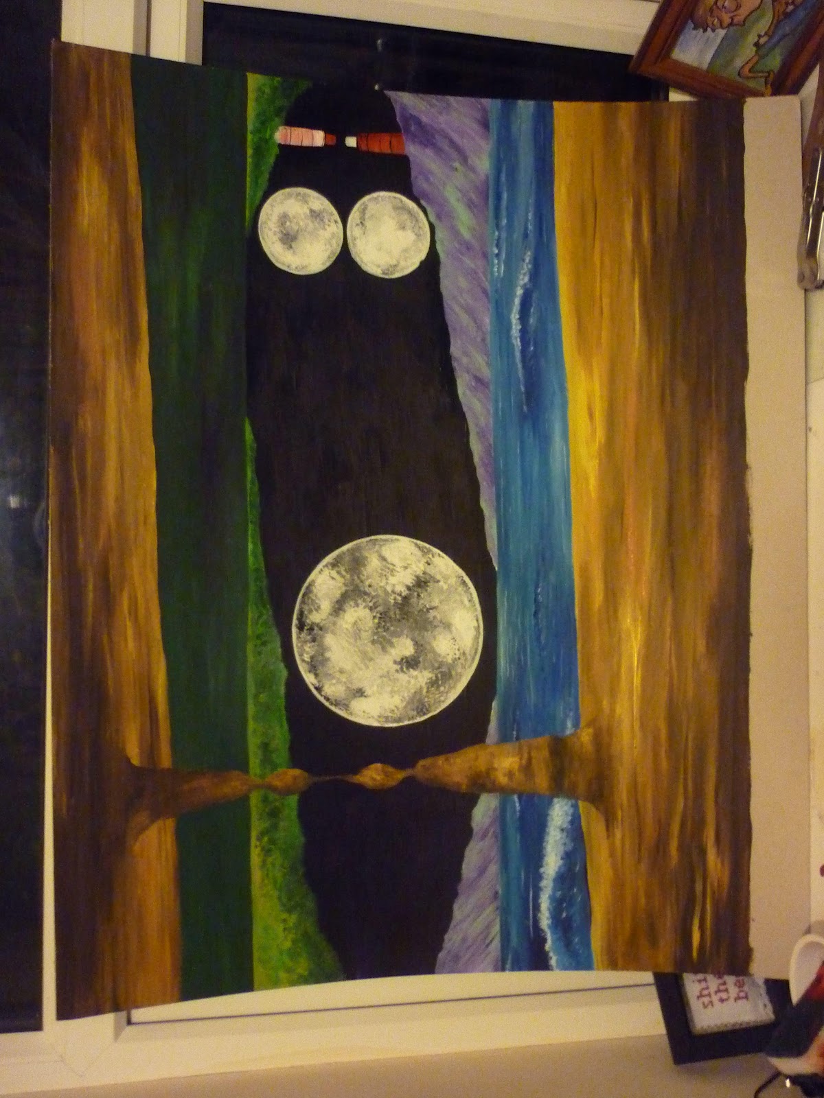
my second attempt at inking. I feel the stronger of the two. I used a falt piece of wood this time instead of canvas, becasue scraping and dribbling was tougher when the canvas dipped. I began by painting a moon with spray paint in the back ground. ink was then scraped over the surface reducing defintion and creating a hazey mist. i think used ink drips to suggest vines/ trees and splurts of vibrant spray paint to suggest shrubs. i think this painitng has a mystic enchanted feel to it as light breaks through the purple trees. if looking closely a figure is seen in the shadows.


i read a story in my book of folk tales. it about a blue ox who made the sky and earth i sketched out what i htought it would look like. i really loved how the tree tops mimiked its fur and clouds added its body shape. 


Bought some water colour tube paints. kind of inbetween blocks and acrylics. i liked the density and vibrance of the colours. this is where my circle fetish started. When both these images are put through instagram  the poppies properly pop out and the trees seem so real.


the sea


outside my bedroom window, using the tube paints again you can get the sense of the sunny weather through the bright greens and blues. This one one of my first studies in the project. It helped me to understand how i could integrate my illustration with water colours. i like the pen and colours to create texture in the trees and foliage however the thick layering of the grass gives no texture. 

more fun dripping ink


Roots.


HOUSES:

i liek the lines and textures of houses and the fact that they are never the same. i also really like the shadows in the windows and the use of graduated colours to create texture and depth.


one of my first commissions


PICKING MY FINAL IMAGES


picking the images for my final display has been hard as i have accumulated many during the project. Some lack the professional finish/ composition of others; but that is not to say they haven't been helpful for learning techniques and in the long run improving the professionalism in later paintings.


i have chosen my final images because i feel they truly show my journey throughout this project and in nature. 
The mixture of intense line work and expressive colours make for mystical, beautiful landscapes.  Instead of sticking to my old imaginary ways i have found and used real environments as inspiration.  i like to find spots that are enclosed from man and/or are capturing back their lost land. I want to express to others the importance of nature to man and to stop and realise what our greed is doing to our planet. i want to portray natures  psychological and physical connection with humans and help others discover its beauty.


EXTENDED MAJOR PROJECT PRESENTATION


For the Extended major project hand in, i will be displaying my final pieces on card inside a display box. The reason being that the display BOOKS you can buy would be too restrictive for the size and orientation of my paintings as i have a mixture of both landscapes, portraits and circles. A box means that paintings must be removed first therefore giving the viewer the freedom to move it around. It also makes each image special and you go through my journey as you take each one out. i have gone for a portfolio plus, deep black display box to accommodate for some of my thicker paintings


i also ordered thick black card to mount my pictures on but they have not arrived yet, so i have used thin black paper. it looks better than nothing but ill have thick card for the gallery


538969


PRESENTATION OF FINAL PIECES - free range gallery


when thinking about the presentation of my paintings i want the display to be personal to me and enjoyable for everyone. i don't want to display just a few neatly on the wall in modern frames. i want to make the wall look like my bedroom; as if i had stuck them all to my wall to see my journey. i love a good charity shop picture frame and i think that they would be the perfect way to display my paintings. they bring a kind of warm homely feeling to the paintings and give the impression that the paintings stand the test of time. The displaying of the paintings would represent the chaoticness of my working methods and creativity. as well as show a general time line of my exploration.


As well as hanging and displaying my images i would also like to make a seperate book/ or portfolio box for the table in front. i want people to be able to see my journey of exploration. i would liek the book to correspond with the images on the wall, showing sketched made a long the way and telling stories of funny events. i want the audience to feel as though the drawings are precious and all indivdually unique.


TIME MANAGEMENT


This project has allowed me to develop several paintings and sketches at the same time, meaning I didn’t become bored, complacent or stressed about the outcomes. I feel that this relaxed attitude has allowed me to truly explore myself and landscape. With my continued interest in my project i have been more than happy to analyse and contextualise my work throughout, whether its been in my blog, skechbooks or Professional practice. This has meant i have felt relatively unstressed about the impending deadline. i hope that i will keep this mentality in projects to come.


CONCLUSION


During my project i have grown inseparable from my water colours; My skills have improved because of my continued exploration and creation. One of the main influences during this section of my project was a variety of artist on the painting and drawing channel (propeller TV). There unique uses of watercolours and compositional advice has been invaluable. They force me to better my own skills and practice more.
 http://www.thepaintinganddrawingchannel.co.uk/about.html


In this project i have changed my view on my own interpretation of the land. Before i would explore without sketching or paintings what i saw. Instead i would use photos and memories at home to create msytical/ imaginary locations. However i have learnt that the wilderness offers countless beautfil/ picturesque landscapes, you just have to look for them. This project hasn't jsut been an exploration of landscape but an exploration of myself and my skills. i can see now that sketching and painting outdoors has seriously improves my understanding of trees, grasses, plants and animals. Meaning i am more comfortable when documenting the places i find.This has been my favourite project of all and i feel i have learnt so much.


Monday, May 7, 2012

new title

EXPLORING LANDSCAPE

I wanted this project to be an exploration of landscapes as well as an exploration of styles, techniques. I wanted to produce a series of paintings and illustrations of landscapes; real or imaginary, based on my interpretation and Portrayal of Britain and Nature. I feel that by having a wide variety of approaches and locations itwill help me to develop during the project and keep me interested and creatively ambitious. 

 My task for this project was to explore. and i have spent the last 2 months exploring the landscapes around my local area, Bournemouth. Because of my proximity to the sea, it has played a major role within my paintings. it also shows contrast to my paintings produced at home in bucks, as coastal exploration was never easily possible. However the seaside brings back nostalgic feelings of holidays. Both areas are personal to me and i feel like this relationship with the land has helped me relax and appreciate my surroundings. i have also enjoyed finding new areas that inspire and amaze me.


 quick study of a local gold course. loved the curves of the grass and bright green grass against deep blue sky. the simplicity in this painting creates a sense of isolation and loneliness.
Again, another experimentation with wet in wet for the sky. I really like the bleeding of each colour and its reflection on the water. It creates a warm feel to the location and a pleasant contrast to the greens and grays of the path and leaves. i also like how the painting seems to be escaping from its circular boundary

a simple and quick painting from eastbourne. i feel the background is too pale and uninspiring. however i really liek the textures in the grass. something i take into consideration in my next painting.


Unused cliff painting - testing out instagram (putting areas in focus)

Dorney - Jubilee Bridge
in this painting i was experimenting with water in water. I really like how the red autumn trees leak and branch out into the sky creating soft suggestions of trees and leaves. The rigidness of the bridge creates a stark contrast to the organic trees

I experimented with interpreting the landscape through an imaginary fish eye. The circle helps round the foreground wheat like a fish eye and the clouds were produced by dabbing tissue on the wet blue sky. this technique is really effective at creating soft, textured clouds. however the colours are weak and need more depth.

I was in London one weekend and surprisingly i found myself in a relaxing garden with grass and trees. a rare sight. i liked the random direction of the tree branches in comparison to the rigid house and the continued use of the brown throughout the picture.i also enjoy the bright white of the windows; as if they are inviting you in to the peoples lives within,.
 Simple quick sketch and paint of a local tudor house. i like the simplicity and the white of the paper for the house.at first i really liked the tree however now it seems quite flat against the house and the leaves need some definition.

 Dorney rowing bridge - where the next olympics are oging to be. used to go here as a kid and the water is nice to swim. a really quick wet in wet painting. The techniques has produced some lovely suggestions of trees behind the bridge. the bright red of the bridge stands out perfectly against the greens and blues. i also like adding some foregorund grasses to make the image more personal and creating depth.
 Initallially i was going to paint this sketch but i felt my line work has created a lovely contrast of thick secure lines and some frail leaves and twigs. the positiion of the logs also leads the eye to the couple walking in the middle.


some photos from my journey:

GUILTY CULPRIT - the ducks invaded the tent treading on my palette and then all over my new painting, haha

amsterdam

new forest

swangae white cliffs

sad face in the tree

mirrored


Other paintings:

tree of life
love the bright contrast of yellows and oranges on the black


waves

early attempt at making up a stream and a realization of how hard it is to paint loads of really thin trees. SOLUTION - masking fluid

whirlpool . i wanted this picture to be spinning to create a moving whirlpool

study of the sea in oils - love the movement of the water created through the expressive brushstrokes.

using acrylics and water colours to bring life to the trees and grass. Also tried to use different pens for the houses but they smudged with the sky.

cliffs - experimenting with scraping and blending of oils


Friday, May 4, 2012


ROTATIONAL PAINTINGS :
The moons explored depth, light and rotation, making the viewer reconsider the way they understood the landscape and showing recognition of landscapes hidden beauty. I also wanted the painting to be fun and interactive by making your brain work to understand it.


----------------------------------------------------------------------------------------------------------------------

OWL PAINTING -

INITIAL CONCEPT and INSPIRATION
this painting is my first illusionary concept, i wanted to create a painting that was interactive with the audience, they have the ability to change the location, environment and context in a easy rotation of the painting. where artists like Rene magritte use perspective to create illusions that can be weird from just one angle i wanted to diversify the viewing dimensions as seen in ..................... painting; where the skull can only be seen from a certain perspective. i wanted to have multiple contexts via multiple angles.

PREP:
My prepatory work for the painting involved going to the coast line around bournemouth and sketching the surrounding area. I feel my painting has benefited from my excursions as i have gained first hand experience of what these places feel and look like. by sketching the ocean and cliffs i gained an understanding of the sharp edges and windswept trees. sketching the sea first hand also helped be release the rigidness of my water drawings beforehand. i saw how the waves moved, crashed and dissapaited and figured out how i could portray their movements through drawing and paint

DEVELOPMENT:
This idea began as a quick sketch in my book, i then made a smaller mock up version using colours i thought would work well and checking out the composition. When creating the larger piece i decided to change the bacground stalemites from human figures into 2 light houses. i felt they related better to the cliffs and water edges they would be close to and it allowed the foregorund stalecmites to stand out more.

REALISATION:
In this painting i hope to protray a variety of potential contexts, locations and figures. You can see the painting through the eyes of someone in a cave (indicated via the stalemites and dark foreground) , enclosing the viewer wihtin the image. The suggested human shape of the stallecmites also helps the viewer relate to the image and feel as through they are looking at someone looking at the scene. (angle A) i have used a more yellowish tone to the foreground as if to indicate sand, linking it with the waves. cliffs enclose the water and a lighthouse standsa alone next to a moon.
(angle B) a slightly closer view of a log in the forground (including more tree browns) in the mid ground lies either a dark lagoon or grass land enclosed by large shrubs.
(angle C) the vertical angle shows a compleltely different concept. An owl stares wide eyed at the viwer clinging on to what once was a stallecmite but has now adopted the representation of a tree branch. the large moon is its belly and the space ship suggesting its beak. the sea, lagoon and mountains now become abstracted trees. the waves now becoming the knots in the tree


----------------------------------------------------------------------------------------------------------------------
 
ADVENTURES
 
i have also been exploring woodland areas. which has been extremely beneficial; not only for subject matter to draw, but for inspiration, ideas and amazing natural occurances. i was told in my tutorials that i need to draw more from real life, so i took my sketchbook out with me.
 
 i really like the naturalness of the trees in this image. by scrapping ink over the back ground i have created blotchy irregular trees. i also like how the image lacks any sort of colour, making the forest look dead or impenetrable .

 one of my favourite paintings so far. i love the vibrant colours against the white and black trees. i originally painted a moon in the background then used the same method as above to create the trees. Again the trees have an organic feel to them, the ink expanding and moving like the trees. The greens and pinks give life to the foreground and create some really weird patterns with the ink.


 _____________________________________________________________________________

Although I really enjoyed creating these first images, the pressure to develop and produce more of these surreal rotational works was proving unsuccessful and stressful; and slowly I began feeling restricted by my originally open brief. To relieve the stress and in an attempt to gain some inspiration I spent my time travelling and exploring my local countryside. During these adventures I was sketching and painting places that I felt evoked emotion and reflected the beauty of nature. (as well as accumulating some funny stories).


When I expressed my anguish at my next critique it was clear from Joel and Lisa’s reactions that they felt my exploratory watercolour paintings and sketches had more professional potential and showed a unique style of interpretation. I was more than happy to take on a new project that I knew I truly enjoyed and understood. This was my chance to explore and appreciate the British landscape; letting me show others the hidden beauty of landscape.


THIS BOOK IS INCREDIBLE!!! i have read the first section. and its so eye opening, he talks about the images your dreams produce, how they are connected with your consciousness and their underlying symbolic meaning. He also talks about how mans connection with nature is vanishing becasue of our overuling consciousness and need to control our actions. i kind of wish i had read this book at the start of my project, but it seems to have come at the right time to influence my landscape aintings. it has made me appreciate my connection with nature and encourage my creativity.